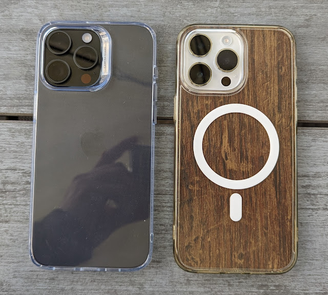
Why the Apple iPhone 14 Pro Max is better than the 15 Pro Max
Forgive the click bait(y) title, but there's actual evidence here, I promise. Note that I did write an article before availability, putting forward worries and concerns, but I've now had hands-on to confirm a few things and report back.
In fact, it's the first time ever in the iPhone line-up/evolution that I seriously think the old 'Pro Max' model can be argued to be better than the new one. (Admittedly, that I already own the old one [14 Pro Max] and didn't really want to spend over £1000 on the 15 Pro Max possibly helps my argument from a personal perspective.)
(There's one big win for the new model, of course. Type C connectivity has been a long time coming - but this will take several generations to become established in iPhone/Lightning households and maybe I'll come back to this in a future article.)
My observations then:
1. The titanium shell is trivial to scratch
We knew already that titanium scratches more easily than stainless steel (as used in the previous Pro models), but it was used to reduce weight. However, the plain titanium scratches quickly and the (PVD) coloured versions (including black) are way worse and will be a disaster if the phone isn't cased, I predict.
As evidence, see Zack Nelson's durability test on the black iPhone 15 Pro Max. Anything sharp will mark the phone's coated titanium sides. (A case solves this issue, of course - and I reserve the right to keep on saying this!)
2. The '2.5D' curved screen edges and smaller bezels make the screen more vulnerable if the phone is dropped
To be fair, although this is true, Apple's Ceramic Shield is so strong that screen cracking is still unlikely, but it's sill worth noting this design change. There are now several drop tests online (I hate them, but hey...) that show direct comparisons to the flat screens and stainless steel of the 14 Pro series).
3. The back glass is more liable to crack
As demonstrated by Zack, the iPhone 15 Pro series back may well be more repairable (in that it can be removed by Apple without having to take everything else out of the phone body first) but it's also much weaker. The combination of not being bonded so strongly to the phone body and the weakening around the integrated Qi charging coil (see various teardown) made the back glass shatter immediately when pressure was applied.
I guess I can insert again a comment about real world users having cases on their phones, but I think even then care is needed not to stress the 15 Pro series frame.
4. The 'zoom gap' is real
From my previous article, the telephoto in the iPhone 15 Pro Max is now 5x rather than 3x, thanks to a tetra-prism system and 3-axis sensor shift stabilisation. Which sounds 'better', and will be for snapping birds at the end of the garden - but there is a very real 'zoom gap', so 3x and 4x zoom shots are all digital, and thus significantly worse than on the previous 14 Pro and 14 Pro Max. I've ranted about this before, but 99% of shots you take in real life are probably zoomed less than 5x. Look back in your own photo library, if you don't believe me.
For me, it's 75% unzoomed, 20% 2x (easy on the 48MP iPhones, of course, with lossless 2x smart crops), and then 5% zoomed shots, typically 3x but occasionally digitally zoomed further, to 4x, for more pleasing framing. (Plus a handful of ultra-wides.)
Here's my diagrammatic presentation of how image quality varies by zoom level on each generation:
(The standard 15 Pro stays with the 3x telephoto, which is a good call, I contend, so users of the smaller Pro phone can ignore all this!)
5. Portraits are now much closer
Apple pioneered using multiple lenses to produce 'portrait' shots, where the background can be artily blurred to give subject separation, with the last few generations of Pro iPhones using 3x telephoto lenses to give a pleasing head and shoulder portrait when shooting at a typical social distance, say across a pub or restaurant table, of when chatting at a party or event.
For example, I met up with a fellow geek and here's my shot of him across the pub table on my (now old) iPhone 14 Pro Max:
At the same time, across the table, he used the new iPhone 15 Pro Max to take the same 'telephoto' portrait of me (in landscape, unfortunately, I forgot to ask him to shoot in vertical mode too!)
So actually a pretty good portrait in terms of image quality (the background blurring can be dialled down in Photos on both phones with a simple slider, after the fact). But a very different framing and much 'closer', optically. More err... intimate!
Now, this is isn't necessarily a bad thing, but the option to shoot 'head and shoulders/upper torso' is now gone, and if you want that then you need to step back. We tried standing and an extra metre away and he took this of me on the 15 Pro Max:
This was taken at a distance of around 2.5 metres. The change in portrait telephoto behaviour is something to bear in mind at the very least. To be fair, I have seen some stunning shots at 5x of people caught 'unaware', i.e. with a natural expression, and it's this sort of portrait shot which will be more effective on the 15 Pro Max.
6. The mute toggle is gone
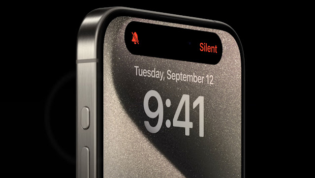
Again, from my previous article, the action button is replacing the traditional mute switch, and is configurable. But only in that you can assign a function other than silencing the phone. It's tempting to assign it to Camera or similar, but you can only pick one function, and if something other than mute then you have no way of silencing the phone without looking.
Plus the old switch was instant and you could check its status in the pocket with a finger. Now it takes a second to do the long press and you can only find its status, sight unseen, in a pocket, by activating it or taking the phone out and looking on the display.
Assigning the action button to Camera is an obvious second idea, but it's on the 'wrong' side of the phone (and at the wrong 'end', at least for a right handed person) to be a substitute shutter button.
For me, the Action button isn't a step forwards, especially in that the physical mute toggle was a unique selling point in a crowded phone world.
Verdict
Put all of the above together, and you can see why I personally won't be 'upgrading' to the 15 Pro Max.
Moreover, Apple always stops selling the previous year's 'Pro' phones when the new one appears, so second hand values of the 14 Pro Max (in particular) will be high for quite some time.
(In fact, it's notable that Apple no longer officially sells ANY stainless steel iPhones. End of an era?)
PS. If you like this feature and want to support my work then please do so here via PayPal. Thanks.


Comments
Never ever again will i buy a phone with a glass back. I will never understand such a poor design choice.
As for the curve screen : years ago, my wife's iphone 6, which had a glass protection screen, fell right on the corner, one of the few places not protected. The screen cracked beneath the protection screen. Seriously, phone makers have to hire designers.