As usual for my case roundups, I'll cover a variety of styles, with most (though not all) samples supplied by MobileFun, kind people that they are. See their complete range of iPhone 12 / 12 Pro cases and covers. See also Noreve's iPhone case range here. And [Update] see Box.co.uk's iPhone 12 Pro Max cases here.
But on with the individual cases, each link goes to the relevant product page, of course.
Of note is that Apple introduced 'MagSafe' magnets to this year's iPhones, with the result that official Apple cases also have circular MagSafe features - and the prices have gone up again, with the Apple cases now being £49 (in the UK). Almost fifty quid for a case!
Far better to pay a quarter (or less) the price and get a simpler affair from a third party. OK, you won't get a 'cool' MagSafe animation when you put the case on - but Qi charging still works through all of these designs (I use it nightly), it turns out you really don't need magnets after all if you're happy centring the phone on a Qi pad yourself (you can still 'feel' when the magnets are centred).
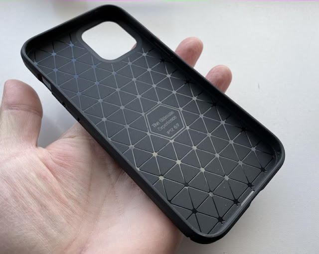
Advertising itself as 'military grade protection', this is an even tougher TPU case that we're used to seeing from Ringke.
The sides are textured and grippy, the back has little 'feet' that lift the phone from dirty surfaces, and there are the usual thickenings at the top and bottom, to protect against face and back drops.
Terrific stuff. The back is tough and textured too. It's almost impossible to imagine one's iPhone being damaged inside this, though you have to be OK with matt black!
Score: 9/10
Smoked black, rather than opaque black, this is a protective and understated option. You don't get to see the colour of your iPhone, but you do get some extra grip from the smooth TPU.


As usual with Ringke, there are the raised top and bottoms, though only on the front face this time - the back is completely flat. But perhaps for a professional this might add to the style in the office?

The button covers are top notch and feel just right, an area where other cases let the user down.

Not the cheapest Ringke case in this roundup, but fair value for money - you're getting quality materials.
Score: 8/10
A classic TPU design (first seen from Spigen?), with mock metal texturing and interesting panels moulded into the back and with tough matt TPU all round.
You don't get extra corner protection, mind you, so ultimate drop safety isn't assured. But you do get a glass screen protector thrown in. These are 'love it or hate it' accessories and arguably not needed on the iPhone 12 range, given the Sapphire Shield glass. But if you were eyeing up a screen protector anyway then this combination ends up being good value.
Score: 8/10
As thin as the name suggests, this is superb at not adding size to your iPhone, but at the expense of any kind of premium feel or protection - for such a large phone this is a compromise too far.
The sides of the case barely cover the sides of the phone, and with zero 'wrap around' over the screen front, there's nothing preventing the very flimsy (thin) TPU from flexing and pulling away at the slightest stress.
It goes without saying that there's no extra corner or face/back protection.
Disappointing - I've been a fan of Olixar's Ultra-thin case for smaller phones, but it just seemed... not enough on something this big, heavy, and expensive.
Score: 6/10

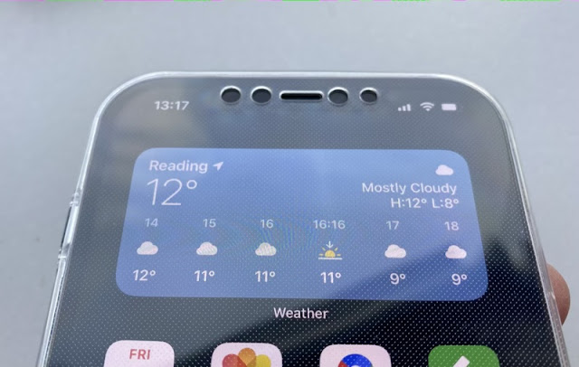
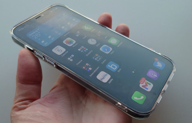
This is an odd one, to be sure. A two -part case that is both traditional protection and screen protector. There's no delicate way to put this, but... it's like having your iPhone in a condom!
Surprisingly, once coaxed into place and with plastic gripping plastic, the phone is still usable. Yes, you're tapping and swiping clear TPU, but it's doable. Perhaps this is the phone case to use in a young family environment, where jam and other unmentionables might otherwise be smeared on your expensive phone!
Yet, despite the unique selling point, I can't really recommend this solution to the every day iPhone user - it's just crazily in the way of the full responsive, HDR iOS experience.
Score: 6/10
There's a lot to like here, from the seemingly reinforced corners (they're not really) to the frosted clear back and camera island detailing.
However, I have issues with Olixar's design here. It feels fine in the hand at first glance but then you start to use it...
The side buttons are all flush - and bear with me for this isn't just a cosmetic factor. The buttons are almost impossible to find 'blind', so you have to fiddle around finding the right place to press. And then you find that the flush nature means that you have to press harder than with a prominent button since you have less mechanical leverage.
Add in the lack of face or back drop protection and I wouldn't recommend this case at all. Sorry, Olixar, I do like some of your designs, but this one's a no go!
Score: 5/10
Mimicking Apple's soft silicone finish, Olixar has done a good job of giving executive casing at a quarter of Apple's charge. The case looks and feels great.
Unfortunately there's not the same structural rigidity as Apple's offering, so the bottom corners are very loose in practice. The slightest pressure and all protection is gone. Add in the wide open bottom edge (I lost a screen to a bottom edge drop last year) and I'd rate any protection factor here as very low indeed.
It's more about looks and style. Which is fine, as long as you're in a carpeted office!
Score: 6/10
So close, Olixar, so very close. As wallet cases go, this is potentially top notch, with thankfully thin front, back, and hinge material, meaning that the folded/closed iPhone isn't unbearably thick.
There are two problems. First, the front card slot (not much of a wallet, with only one card capacity!) is nicely inlaid, but despite the thumb access hole it's still almost impossible to get the card out and past the hinge. On the other hand, you could argue that the card (perhaps ID of some kind) can't fall out on its own at any point, so there's some security there!!
Then there's the poorly made phone holder itself - the TPU is too thin (again) and bendy. OK, the phone is unlikely to come out because of the folio flap, but it always feels... cheap. Thanks partly to the amateurish seam running down the length of the right hand edge.
That there's a legend saying 'IP 12 6.7' can be excused as this was perhaps the first case off the production line, before the phone was officially released - I'm sure it will be gone by now.
I'd love to see higher quality TPU used and perhaps a slight redesign of the front flap in terms of card storage. In the meantime, a modest score, I think.
Score: 7/10
It's been quite a journey to get here, but we arrive at my all round favourite case from this roundup. Everything, repeat everything about it is perfect.
Tough TPU with reinforced corners and face drop protection? Check. Twin lanyard holes? Check. Clear finish that shows the character of your iPhone? Check. Button covers and general feel? Top notch.

Price? Cheapest in this round-up, which makes no sense. If clear cases are your preference then look no further, this is the Rolls Royce and is dirt cheap. I just don't know how Ringke do it.

NB. This case is from Amazon UK, not MobileFun, despite the latter being a Ringke dealer. And no, I don't know why they don't stock this!
[Edit: see below for an updated version of this 'perfect' case!]
Score: 10/10
It's time for some luxury - this is hand-made by Noreve in finest (and highly customisable, in terms of colour and texture) leather. Smell it, caress it, etc(!)
It's a wallet case, with space for two cards and some cash (notes), though having used it I'd recommend limiting yourself to just one card and not too much cash, otherwise the closed case starts to look over-bulky:
But the idea of combining wallet and phone case is still appealing. Yes, all your 'eggs are in one basket' if stolen or lost, but on the other hand you now only have one thing to take with you:
As usual with wallet cases, there are thickness penalties to the hinge and backplane, doubling up leather and (in this case) leather-covered tough plastic. The back of the case shows the depth involved, with even the camera island being far recessed:
I did note that some of the glued leather wasn't quite perfectly in place, but then again this is a hand-made case, no machines involved, so it has a certain artisan charm, which may compensate!
The review red leather is just one of many options, with some of the textures and colours outrageous - at extra cost. If you can afford it and you want a wallet case, whatever the thickness, then look no further and knock yourself out.
Score: 8/10
Shown here with the red bag that every luxury Noreve case arrives in (making them good for gifts!), this is the classic backplane cover and feels fabulous in the hand, with the iPhone snug inside:
The premium textured leather, the smell, the soft feel, it's just... like settling down in a new sofa!
The cutouts on the side leave the buttons and mute switch available, as you'd expect, the cutout on the bottom (shown below) is to allow access to Lightning port and speaker, though I'm not so sure about the cutout on the top - what's that for?
Ultimately these top and bottom cutaways are the only real weakness of the design - the only points where a direct ground impact with screen edge are possible. And I lost an iPhone 11 series screen to this very design weakness. Or I might just have been very unlucky!
Possible unlucky ground impact aside, this is just about my (subjectively) most loved iPhone case ever - it's the only one that really makes the iPhone 12 Pro Max feel like it's worth over £1000 in cased state!
Score: 9/10

And now we come to an item that asks the question of what one needs from a phone case. At first glance this is just another clear TPU offering - see also the Ringke Fusion above, for example. But it isn't.
This is effectively ARMOUR. Yes, it's TPU and it's clear, but the solidity of the plastic, the thickness (up to half a centimetre on the corners and edges!), all scream protection. If the aim of putting on a phone case is to make sure it survives accidental drops then mission accomplished.
The case packaging claims '3x as many drops as military standard' - I'm not sure quite what this means, but including the military sounds impressive and, after using the Symmetry design for a few days, I'm 100% confident that my £1000+ iPhone 12 Pro Max would survive multiple drops from waist height.
Heck, this is the sort of design that they show off by dropping the phone from a helicopter. Which is not as drastic as it sounds, since school physics tells me that the phone actually reaches 'terminal velocity' (thanks to air resistance) very quickly, so dropping from a helicopter isn't much different to dropping from a few tens of metres.
But still... Solid (yet clear) plastic all round, even beyond the camera protrusions, I believe OtterBox, plus I know their name from two decades in the mobile industry. An OtterBox case is normally seen as the ultimate in protection.
In the hand, there's an extra few millimetres in width compared to other TPU cases, plus an extra few grammes in weight. So noticeable, but if - again - your goal is protection then take the hit, I say.
Some of the mouldings are a little odd, especially on the bottom corners, but I'm prepared to believe that they're design choices to improve corner drop protection. By the way, you can see the TPU thickness here on the phone's bottom by looking at the port and speaker recesses!
There's even an extra protector for the err... protector. Look closely at the corner of the mouldings on the back and you can see an extra touch plastic protective layer on top of the existing TPU! Unlike on the Ringke cases, this isn't a factory thing that should be ripped off when you get the case (to keep it pristine) - this layer is firmly attached and isn't coming off. So even more protection for the fragile phone rear glass.
The fit here is so tight (part of the protection, to make sure the case never comes off by accident) that it took me several minutes to get the case ON my iPhone. I'm not marking the design down for this, but I thought I'd mention it, should you need to change SIM card with any regularity!!
Yes, yes, this is all a bit over the top. After a few days, I did remove the OtterBox Symmetry because I just don't need this much protection, and went back to the Ringke Fusion. But - honestly - if my lifestyle was a little more rough and tumble or more adventurous (i.e. the 'Great Outdoors') then this would be fitted and be retained. I love what OtterBox have done - I just don't need it right now! But highly recommended for someone who does.
All of the cases above were from the first few months after the iPhone 12 series launch, and understandably had no magnetic ('MagSafe') elements in their design. But I'm starting to add designs which now do.
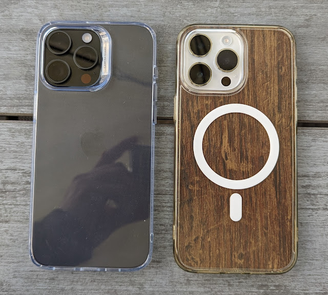
In this case, the 'perfect' Ringke Fusion case reviewed (way) above, which is now available in a MagSafe variant. Meaning that all the usual protections and refinements are here, plus a circular ring of magnets. These 'attach' to any MagSafe accessory and also help keep the case itself on the phone's magnets. It's a whole... system. Ask Apple!
The magnets are help in place with a thin transparent film, not to be confused with the standard clear protective film on the inside and outside of the case and which do need to be peeled off. Happily, Ringke has now added green 'leader' films to show what to remove and how to grip them - these used to be very fiddly to get off.
Once off, the MagSafe design is shown off - the magnets add a millimetre to the existing Fusion design, but the extra thickness isn't really noticeable.
The obvious caveat to this is that the beautiful clear TPU back is now 'spoiled' by the magnet rings, but until scientists work out how to make transparent magnets, this is a necessity!
All the existing protections are here, with corner reinforcements and face/back drop protection, plus lanyard holes and, below, camera island ridge protection.
The proof of it all is below - apply the cased phone to a MagSafe accessory, such as this Apple charger, and it locks the phone down hard. Having used MagSafe through the previous Ringke case, this was dramatically more powerful, I'd say three times more so. Stopping the phone slipping and making sure that Qi charging (here) is as efficient as possible.
It's still easy to prise the phone off the accessory, don't worry.
At £15 or so, this is still great value, I contend. Yes, you lose the classic clear beauty, but you also gain a whole new function. So still top marks!
Score: 10/10


Comments